Interaction with touch screen devices is a big design challenge. Conventional design strategies are giving way to brave new ideas that are functional and beautiful
Man has been interacting with his tools since time immemorial. Stones attached to sticks with strips of leather or animal sinew were being used as hammers with handles by about 30,000 BC. At that time, the tools that humans used, were pretty direct in terms of the feedback they provided. Then came the industrial revolution and the extensive use of instrumentation. Now engineer-designers had to design the ‘display’ of the instrumentation and the ‘controls’ that managed the various parameters to achieve desired results. With the birth of locomotives, automobiles and aircrafts, things started getting a bit complicated.
Enter computers and everything started getting phenomenally difficult. The human-computer interaction is a 50-year-old story built as various small refinements on the basic paradigm of ‘WIMP’; Window, Icon, Menu and Pointing Device. Designers started talking about mental models, metaphors and idioms since things started getting more abstract. With the iPhone and the multi-touch screen, an entire world fits into the rectangle in your hand. Indeed, seeing infinity in the palm of your hand!
The last decade was spent in creating wonderful simulations. Real physical experiences were abstracted into ‘intuitive’ interfaces. From Windows to buttons, and icons to menus, everything has had a real world parallel. But, for a generation, growing up with touch screens, abstraction itself is a starting point.
This is where it starts getting interesting. Microsoft, Apple and Google are dealing with their mobile interfaces with minimalistic design languages. The result is that our new tools of the digital world have a brave new paradigm of interaction.
First one to spring this surprise was Windows 8 with its ‘Metro’ design that was inspired by the highly functional metro signage. The colourful tile based design featured beautiful typography and interesting animations. Microsoft designers point to the Bauhaus design movement of the 1920s which is best known for its rational ideals and essential simplicity of design that laid the foundation of modern industrial design.
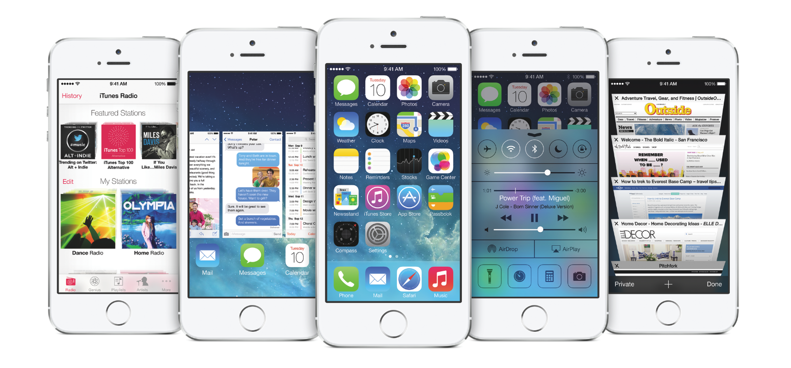
At Apple, interfaces thus far had tried to mimic real materials and objects to the greatest detail, a leather cased calendar, wooden shelves for iBooks, drop shadows and highlights for calculator buttons. This direction known as skeuomorphism, kept up thanks to Steve Jobs’s heavy push. With iOS7, it has given way to ‘Flat’ design thanks to Jony Ive’s celebrated minimalism. Despite initial resistance, like all things Apple, the new design language has received a wide fan following and acceptance.
The latest to get the design band-wagon is Google. With heavy reliance on data driven decision making and functional approach earlier, Google has had a bit of a reverse journey. With its ‘Material Design’, Google has tried to build in a bit of depth for touch screen use, extremely relevant for its Android popularity. Judiciously used animation suggests where things are popping out from and disappearing.
Most designers agree that Google is moving in the right direction. From hammers to touch screen devices, it has been a long journey that has taken us to levels of abstraction never experienced before. And yes, like the hammer, our tools today have to be minimal and functional.
But as Aarron Walter, director of User Experience at MailChimp says, ‘…designing software that’s just usable is like a chef creating food that’s just edible. People are attracted to more than just the practical. We want the things we interact with to appeal to our emotions’. Like all other things, that is where design comes in.
-
With iOS7 launch, Apple embraced a minimalist ‘Flat’ design. Blurred translucency and typography is used to create a richer context of interaction.
-
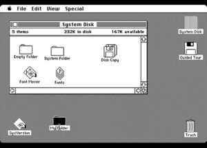
Apple’s 1984 Macintosh was the first commercially successful product to use multi-panel window interface.
-
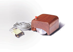
The first mouse prototype by SRI International, designed by Bill English from Doug Engelbart’s sketches. Themouse is one of the elements of ‘WIMP’; Window, Icon, Menu and Pointing Device paradigm that has lasted morethan fifty years of human-computer interface.
-
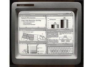
Xerox PARC developed the Alto personal computer in 1973. With a bitmapped screen and a pointing device this was the first computer to demonstrate the desktop metaphor and graphical user interface (GUI)
-
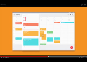
Google’s ‘Material Design’. Google is trying to build depth into the flat screen through drop shadows, transparency and animation.
-
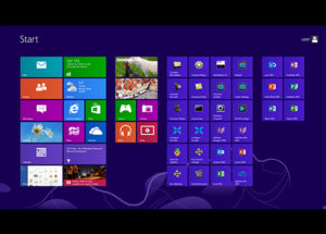
The Windows 8 ‘Metro’ design philosophy with colourful tiles, emphasis on typography and animation. Microsoft designers claim that they derived a lot of inspiration from the Bahaus design movement.
-
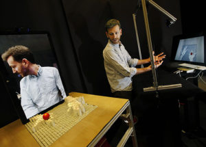
A 2013 photo of graduate student Sean Follmer of MIT demonstrating inFORM, a technology that allows people in one place to interact with three dimensional versions of people or objects in another place. Beginnings of yet another form of interaction.
