The good old boxes, covers and bottles are powerful tools that tell stories of what the product and brand stand for
Good things often come in small packages, but by no means this art is simple. In fact in many cases, package is the product. Walter Landor of Landor Associates was one of the first to study and incorporate consumer response into packaging in a scientific way. He made it a practice to watch consumer behaviour in detail and in fact, he even solicited their response to label design in real life shopping situations. Walter’s philosophy of ‘the package itself must do the talking’ is a fundamental idea behind even the modern day brand and packaging design practice.
Package, of course, has a functional role to play. How a soap dispenser or a ketch-up bottle cap works without soiling the nozzle after repeated use, how an egg tray hold eggs without breakage are the kind of things that new technologies and materials have been trying to address. From the ecological perspective, what happens to the package once the product is taken out of it, is increasingly becoming an important issue for a packaging designer.
Nature still remains a wonderful source of inspiration for how it contains and transports things. Coconuts, oranges, eggs, beans, bananas are some fantastic examples of delicate stuff being transported with biodegradable covers. In fact most natural covers are edible or usable in some form or the other. Scientists, inspired by nature have been at work with technologies that can mimic these. The advent of bioresins is rapidly changing the plastic container composition. In some of the laboratories, researchers have created examples like filling an orange membrane with orange juice, a tomato-flavoured skin with soup and mini membranes the size of grapes that are full of wine.
A package is the first direct interface of the product with the consumer. It informs the user about the contents, it contains and protects the contents. Above all, the package is the face of the product in the retail environment. Like all faces, the package tells a story, a story of where the product has come from, who manufactured it, what it is meant to do and by using or consuming the product what kind of experience a user is going to subject himself to and very importantly, what lifestyle statement is the consumer going make.
As promotional information is shifting more to the pre-buying experience online, consumer is looking to see a more engaging experience in the actual retail environment. Like all design, packaging is constantly getting cast into new forms dictated by the larger trends in society. The good old ideas of putting happy faces on puffed potato chips packs and pastel shades with golden lines on shampoo bottles will be considered highly uncreative in no time.
Packages that stick to clarity and transparency of function, enhance the experience of use, are done with a larger purpose of sensitivity to ecology and trigger emotional connect with the consumer are going to change landscape on retail racks. Designers and marketers with an acute sense of these emerging trends are going to make this difference felt.
-
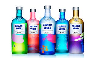
Absolut Unique is a limited edition product. Each of the four million bottles produced is unique in its appearance. Absolut re-egineered their entire production process to achieve this mass customization. -
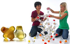
Y water is an organic, low calorie children’s drink. The unique bottle shape makes it fully reusable as a creative aid. -
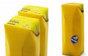
Naoto Fukasawa’s creative fruit juice packaging. The familiarity with the abstraction creates an immediate emotional connect. -
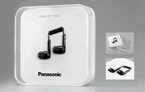
Panasonic headphones, made for the music lover. Clever packaging expresses the product idea instantly. -
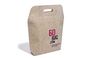
60BAG is made of flax-viscose non woven fabric that biodegrades in 60 days. Being ecologically conscious is increasingly becoming a fundamental driving force behind all packaging. -
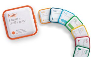
Help Remedies’ medicine packaging. Help would like to change the tone of healthcare completely. -
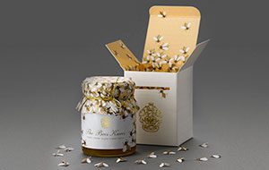
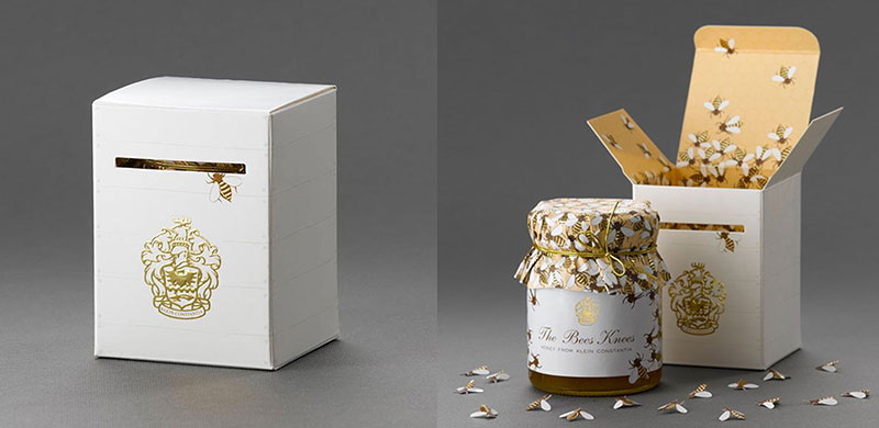
The Bees Knees honey box opens to reveal a bee covered honey comb pattern as well as small diecut bees packaged inside each box. -
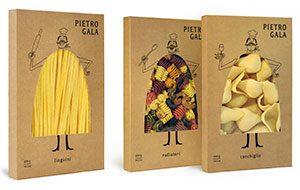
A pasta brand distinguished by handcraft manufacturing and high quality ingredients. The image of the chef and the natural look of the pack emphasizes the brand proposition in a great package. -
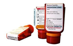
Target pharmacy’s medicine dispensers turn the idea of a pill bottle completely on its head. ‘When opening your medicine cabinet for the first time, you instantly know the name of the drug you’re taking, how to take it, and that it’s yours’
