From German architect Mies Van Der Rohe to Apple’s Jonathan Ive, some designers are working towards ‘removing all that is superfluous so that what remains is the essence’. Interestingly, this Zen-like process of designers speaking the language of ‘less is more’ has given us some of the most remarkable products of the century
Minimalism in arts and design has assumed more importance than ever before in the cluttered visual space of products, print, web and retail. The ‘Less is more’ thought that took root in the mid nineteenth century is arguably the most celebrated design language today.
The phrase ‘Less is More’ as applied to design, is most commonly associated with Mies Van Der Rohe, the German architect. Mies called his buildings ‘skin and bones’ and pursued a lifetime quest for finding a language of expression for the spirit of the post war modern era. One cannot talk about minimalism without discussing the role of Dieter Rams and his tenth commandment on good design: ‘as little design as possible’.
Rams headed Design at the German consumer electronics manufacturer Braun between 1954 and 1995 and evolved a unique brand language of austere aesthetic for Braun. Much of today’s famous design of consumer electronics looks the way it does, thanks primarily to Dieter Rams. He is widely considered as one of the most influential industrial designers of the twentieth century.
The impact that Rams has created can be seen in the work of one of the most well known designer of manufactured goods, Jonathan Ive. At Apple, as head of design for more than a decade now, Ive has indeed accomplished a feat similar to what Rams achieved for Braun in the 50s and the 60s in making their brands household names.
While talking about design principles that Apple bases their ideology on, Ive says, “it is really important to have a sense of hierarchy of what’s important and what’s not important by removing those things that are all vying for your attention…it is one of those funny things, you spend so much time to make it less conspicuous and less obvious”.
Steve Jobs’s and Ive’s fabled interest in Zen is reason enough for many to look at the most ancient austere design that originated in Japan and is popularized by two notable masters of modern Japanese design namely Shiro Kuramata and Naoto Fukasawa. Kuramata’s work displays a unique combination of Japanese art and its structural purity. “My strongest desire is to be free of gravity, free of bondage. I want to float,” said Kuramata. Kuramata’s work, by far remains the most energetic expression of Japanese aesthetic in modern materials.
Fukasawa, whose iconic products now find a place of honour at the Museum of Modern Art, says, “people think that design is something that appeals to their emotions, but in fact people are linked to things every day in their environments, unconsciously, without even being aware of it. This ‘unthinking’ state makes actions smooth…designs that make us feel this kind of simplicity don’t stand out, but entwine with people’s actions and with the environment, too.”
From Mies to Ive, there has been this effort towards ‘removing all that is superfluous so that what remains is the essence’. Interestingly, this Zen—like process of progressive and ruthless elimination by designers has given us the most remarkable products of the century.
-
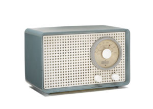
Kleinsuper SK1 Radio (1951) attributed to Artur Braun and Fritz Eichler. The beginning of ‘highly technical look’ of Braun.
-
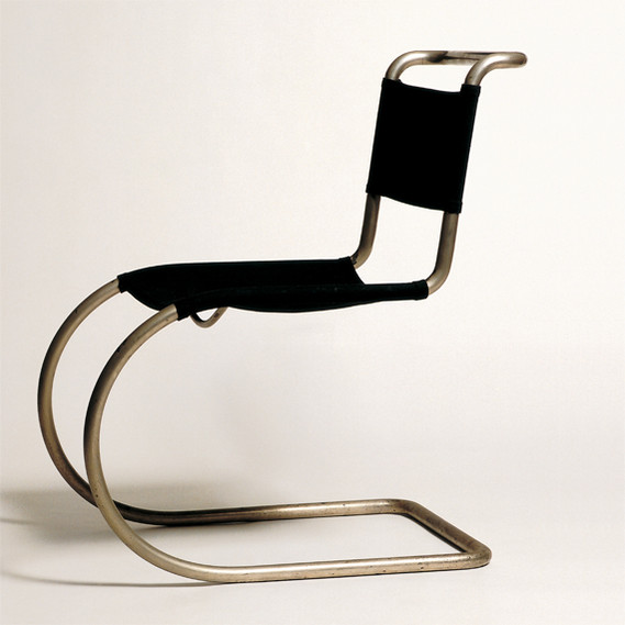
Ludwig Mies Van Der Rohe (1927) cantilevered bent pipe chair titled MR 10 is arguably the beginning of a new design language of the post war era.
-
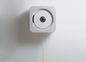
Naoto Fukasawa’s wall mounted CD player (1999). The design is Japan’s most iconic product design of the last decade.
-

Butterfly Stool by Sori Yanagi 1954 combines the eastern simplicity
of form with plywood moulding technique of the West to create a striking minimal design. -
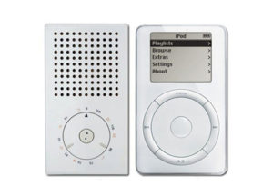
T3 Pocket Transistor Radio, 1958, (L) designed by the legendary Dieter Rams and Hfg, Ulm. iPod, 2001 (R). Many of the iconic Apple designs have more than a passing resemblance to Rams’s work.
-
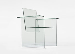
Shiro Kuramata’s glass chair, 1976, is an extreme experiment in creating ‘borderline object’. The glass chair takes advantage of a new glass adhesive invented at that time.
