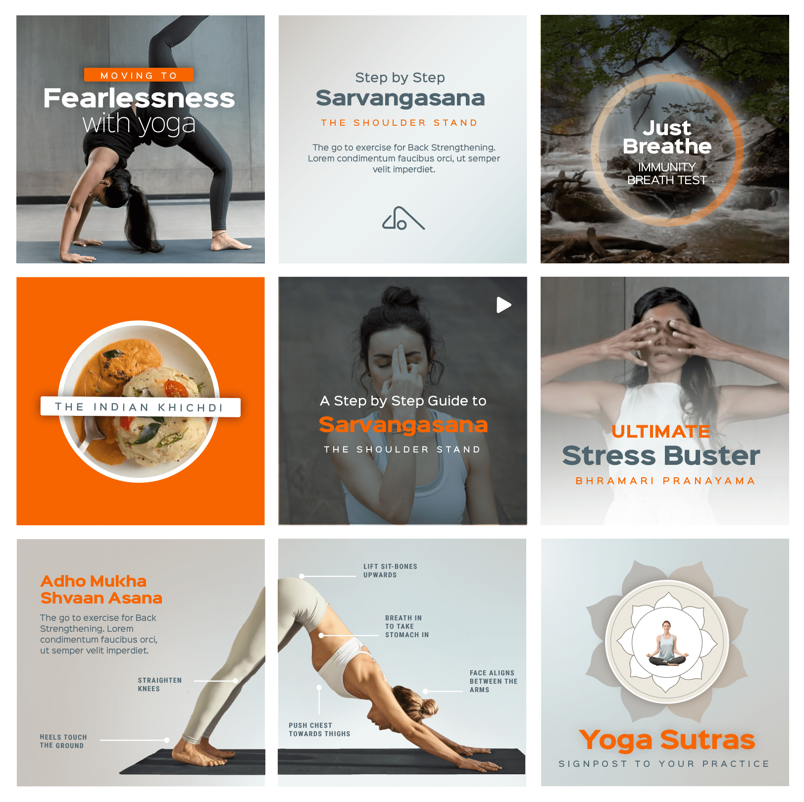
As opposed to live streaming or pre recorded training, practising yoga with an accomplished teacher in an online class has its advantages that can go beyond even attending a real class in a studio. We helped Shvasa create a brand experience that proved it with impact and scale.
CLIENT
Shvasa Yoga
PROJECT
Brand Identity | Web Experience | App UI UX | Social Media
After long sessions with the energetic Shvasa founding team, we came up with a seemingly simple one line design brief; ‘Reflecting the deep-rooted authenticity of traditional yoga while ensuring a seamless, user-friendly experience for a modern audience’. The complexity of the market, the online and offline options the users have for taking their Yoga journeys and the abundance of confusing content everywhere meant that the emphasis has to come back to Shvasa’s unique position.
We prioritised usability by creating an intuitive interface that guides users through personalized yoga journeys. Key elements, such as live classes with expert instructors, small group sessions, and detailed onboarding for personalized class recommendations, were incorporated to ensure every visitor feels supported. The use of calming color schemes and minimalist design allowed the content to shine, highlighting the benefits of yoga practices like Ashtanga, restorative, and pranayama.
Additionally, we built a streamlined booking system where users can easily book trial classes, consult with yoga counsellors, and enrol in custom programmes suited to their wellness goals. The design conveys trust and expertise while ensuring users can effortlessly navigate between content, from understanding the philosophy behind the yoga styles to enrolling in live or recorded sessions.
Making Yoga a habit for life needed a minimalistic design approach. The simplicity put the focus firmly on the content.
—

Strategic use of dark mode, a very clean icon palette and extreme focus on functional user experience resulted into a a very lightweight visual motif. The website, social media and the platform were made seamless. Yoga had to be expressed with its characteristic lightness of being!


