When the Provectis team approached us for advisory and design services for their new brand, we decided to implement a clear three-step approach: brand strategy and aesthetic definition, naming and identity, and packaging design. It all came down to one strong brand idea – ‘Capture Swiss values of precision and high functionality as a minimal aesthetic theme’.
CLIENT
Provectis Healthcare
PROJECT
Branding | Packaging
Understanding the diverse European market was paramount in shaping our brand and packaging identity. We focused on capturing Swiss elegance to blend clarity and functionality, enhancing user experience and interaction. To cater comprehensively to Switzerland’s multilingual population, German and French, and Italian all had to be represented. Each packaging label was meticulously crafted to include these languages alongside English. Additionally, the accompanying product inserts were translated into six languages, encompassing English, German, Italian, French, Spanish, and Dutch. This approach ensured accessibility and inclusivity for a diverse, multicultural audience.
Navigating Switzerland’s rigorous pharmaceutical packaging regulations posed another challenge. We iterated multiple times to refine the content and design elements to ensure compliance with local regulations and mandates. The final packaging not only adhered to international standards but also resonated with consumers as clean, inclusive, and functional.
Swiss precision defines the brand aesthetics with trademark minimalism and desired functionality.
—
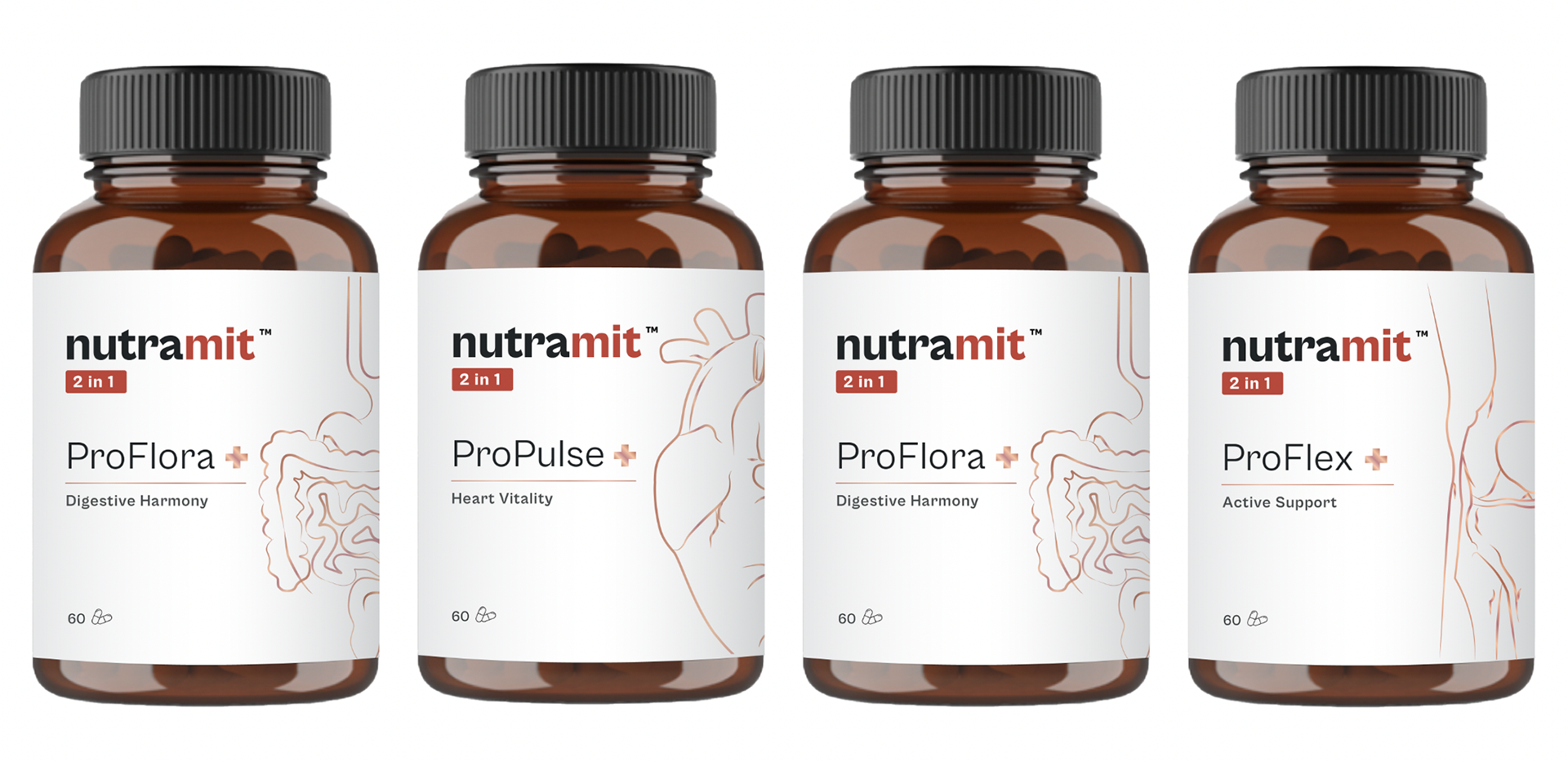
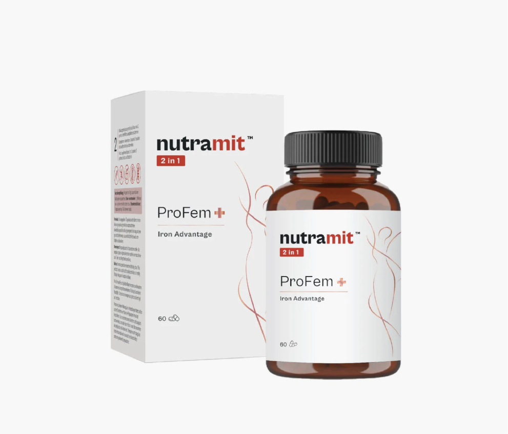
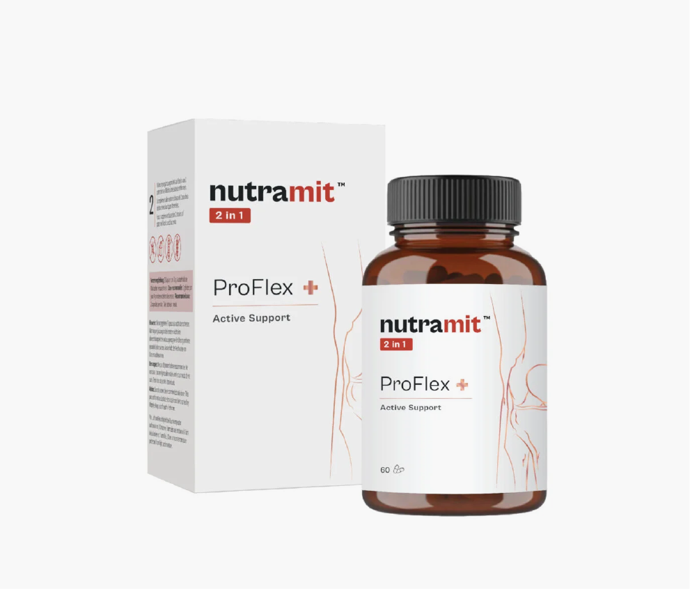
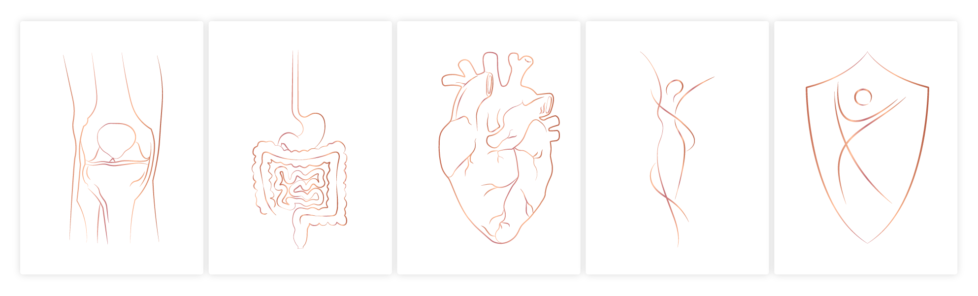
For Nutramit, the new line of high-quality probiotic supplements, we chose the classic white and red colour scheme to evoke a serious pharmaceutical aesthetic. The classic theme is always a dependable choice to convey trust, the most critical factor in the sector.