We had a transformative experience in taking the spiritual path of Narayanashram Tapovanam to the international audience. Through a direct personal engagement with the seers, this collaboration was one of a kind and the results are indeed far reaching.
CLIENT
Narayanashram Tapovanam
PROJECT
Website
Narayanshrama Tapovanam, established by Swami Bhoomananda in 1963, is located on the picturesque slopes of the eastern hill of Pandavagiri, in Venginissery village, Thrissur District, Kerala, India. Swamiji has spent over sixty five years in spreading the eternal knowledge. His unique approach involves making life and interactions divine by the wholesome two-fold path of ‘meditative introspection’ and ‘interactional sadhana’.
The Ashram website has traditionally been just informative, a collection of writings and filing of some resources. During the 2020-2022 Covid pandemic, it became imperative for the Ashram to keep in touch with its community worldwide through video calls and emailers. This was also seen as an opportunity to connect with a much larger audience and spread the message as far and wide as possible, still keeping the strong central character and the way of life intact. The idea was not to make a marketing machine, but become a repository of knowledge to the seekers.
We recommended a backend with a lot of relevant tagging and WordPress based CMS, serving logged on users resources as they would consume on their spiritual journey. The front end was designed keeping in mind the content that the seers wanted to present. The resultant website is a very scalable engaging resource. We also have put in place a team to continuously update resources as they become available, enriching the user experience over time.
The intensity of the project was far more demanding than most of the corporate websites we usually do. The association with the seers provided us a refreshingly different experience of a client – agency relationship, full of love, care and inspiration.
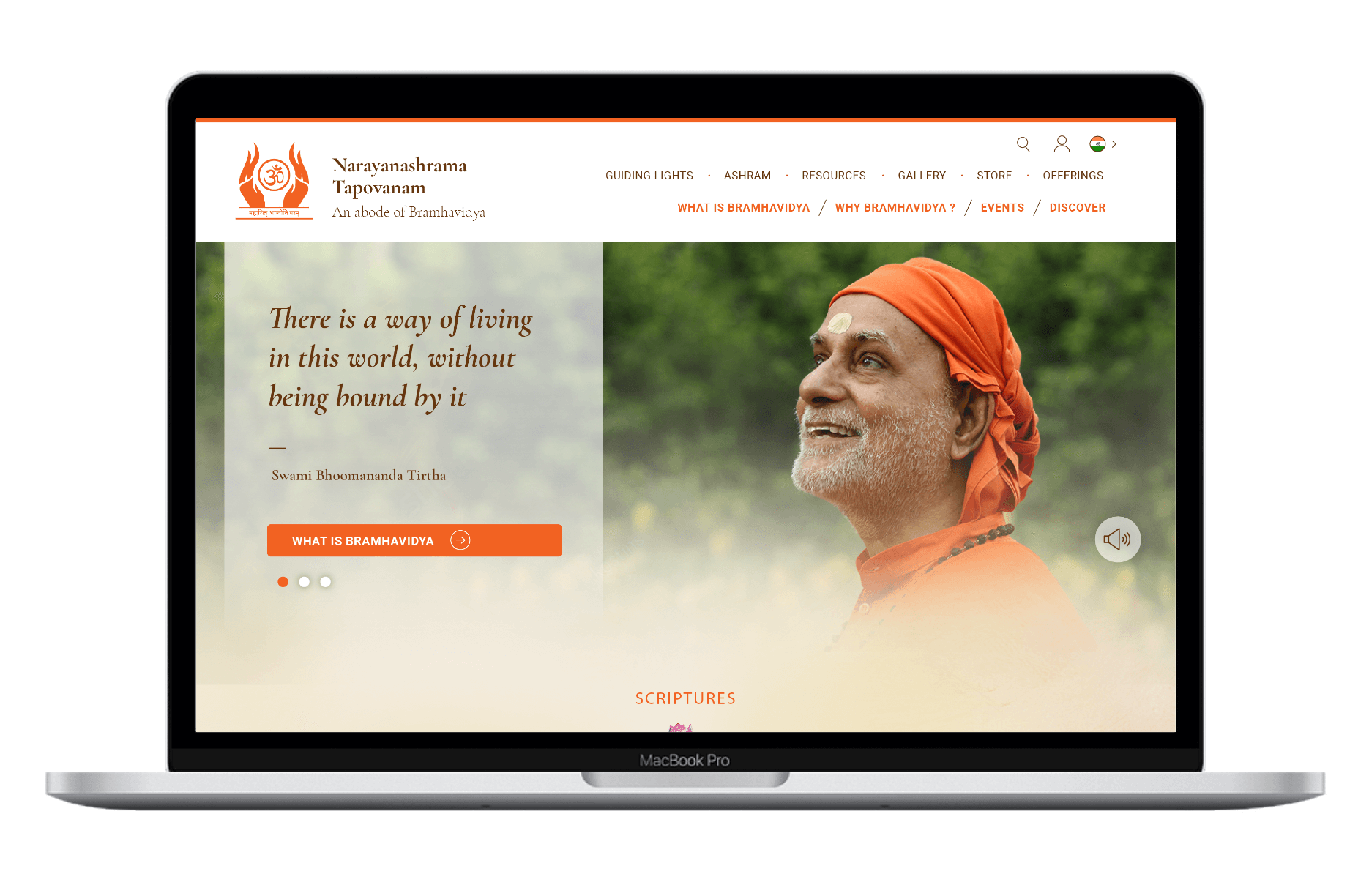
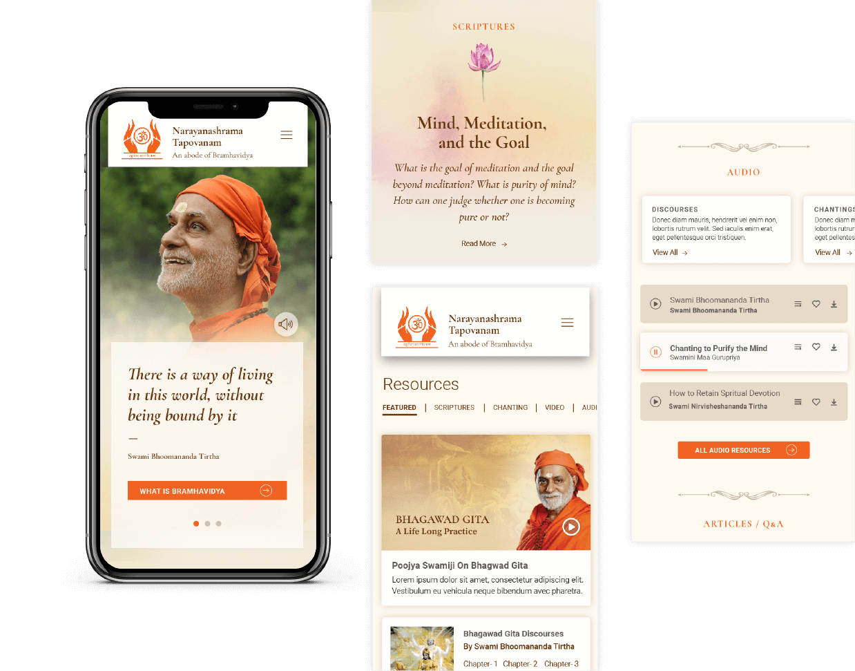
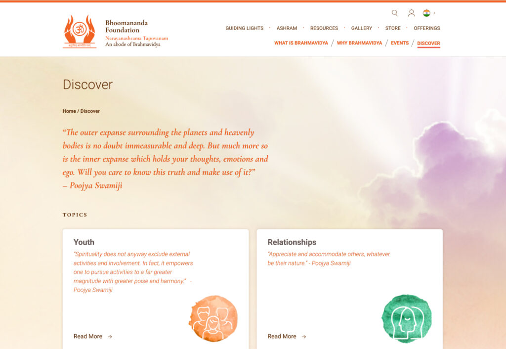
With a distinctive water colour treatment, new navigation and resource indexing, the website is a truly spiritual experience.
—

Not a marketing machine, but a repository of knowledge
The website redesign exercise was seen as an opportunity to connect with a much larger audience and spread the message as far and wide as possible, still keeping the strong central character and the way of life intact.

The focus is on discoverability, navigation and relevance for a logged on user. The content is structured around the user and not just by high level categorisation.
This project was quite extensive as compared to any typical corporate or start-up portal design. It needed us to delve deep and involved comprehensive content structuring and presentation. It gave us the opportunity to interact with seers who always engaged us with love and care.

